Because I’ve been learning to play with Photoshop, and I made the cover for ABDUCTION, and Vanessa asked if it was done in photos hop, I thought I’d share.
This is the Stock image that I used as a background. I love this photo too, I’ve been wanting to use it for a while. 

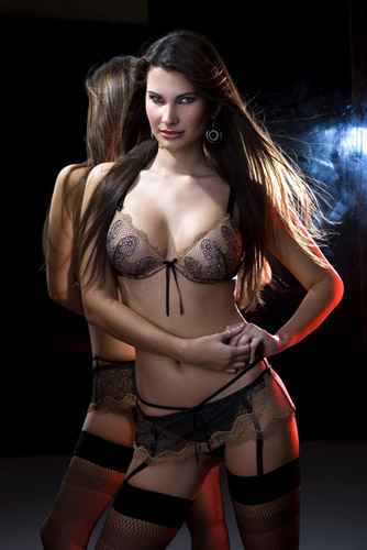
And this is the stock image I purchased to use as Tyla. The woman on the cover. 
It was cut and paste, and mask, and erase, blur a little here there, put them togehter, add some texture, and Text. and the cover came about.
I can’t tell you step by step how I did it, cuz I don’t really know. I’m not that good at this tuff, I just sort of start, and play, and see what happens. But, It wasn’t hard really, just time consuming, and an exercise in developing patience. I don’t have the full Photoshop, only photoshop Elements, but That course from Creative Direction I took a couple weekends ago really helped me learn how to use what I do have.

Good choices for images. They’re both great by themselves, so I imagine the combination of the two is fabulous. I give you a lot of credit for doing that because I am horrible with that kind of stuff.
You did a great job!!! I love the world and the girl is beautiful. I wish I had the patience to do this.
I thought maybe Photoshop came with teh MAC, but honestly the cover was great.